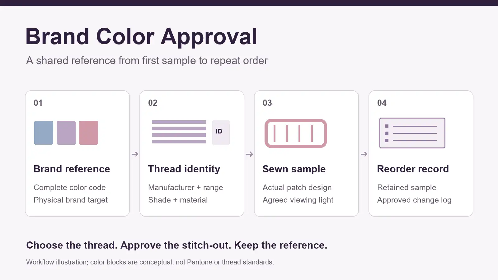
To match embroidered patches to a Pantone brand color, start with the brand reference, then approve a physical stitch-out made with identified thread on the intended patch fabric. Record the thread manufacturer, range, shade code, sample revision and viewing conditions before releasing bulk production. For repeat orders, compare the new material and finished patch against the retained approved sample.
A logo on a laptop, a printed color guide and a shiny embroidered surface can look different. A dependable approval process makes that difference visible while there is still time to choose another thread or revise the design.
What does a Pantone match actually mean for embroidery?
A Pantone reference communicates the intended brand color. It does not, by itself, identify a spool of embroidery thread or guarantee that a stitched surface will look identical to printed ink.
Stock thread comes in a manufacturer's available shades. A conversion service helps shortlist those shades; it cannot turn every reference into an exact material match. Madeira UK's Pantone conversion guidance explicitly describes the nearest available thread, does not guarantee an exact match, and recommends making and approving samples before fulfilling the full order.
Send the complete color reference, including its system and suffix. A PMS reference ending in C or U describes a coated or uncoated printing reference; a textile reference belongs to a different application context. Do not drop the suffix, silently change systems, or treat a bare number as a complete specification. If a physical brand swatch is the controlling reference, identify that swatch as well.
Agree which reference governs the finished patch. A practical arrangement is to retain the brand standard as the color intent and use the specifically approved embroidered sample as the production appearance reference. If they differ visibly, have the brand owner accept that difference or request another development round before bulk release.
Why a screen, a thread card and a sewn patch can disagree
Screens emit light; thread reflects it. Display settings, camera exposure, white balance and image processing can all affect a digital comparison. A printed thread chart adds another reproduction step. Use these tools to communicate and narrow choices, then compare actual thread and embroidery physically.
The thread's sheen and stitch direction also affect how light reaches the viewer. Broad fill areas, small satin lettering and a border may present the same shade differently. Turn the sample while reviewing it, and compare equivalent areas at the same orientation. A highlight is not enough evidence to conclude that the wrong thread was used.
The surrounding design matters too. Exposed base fabric, gaps between stitches and adjacent colors influence the finished appearance. Review the actual size, ground fabric and stitch layout. If the design also needs a coverage decision, use the separate guide to embroidery coverage for apparel patches before freezing the sample specification.

Step 1: Send a color brief the supplier can use
Start with the original logo artwork and a color map identifying each stitched area. Separate the main brand color from secondary fills, small lettering, the border and any exposed fabric. A single instruction such as "match our blue" leaves too much open to interpretation.
Include:
- The complete Pantone reference or other agreed physical standard for each critical color.
- The artwork revision, finished dimensions, intended patch fabric and border treatment.
- Which colors are brand critical and where an approximate stock shade may be acceptable.
- A garment or accessory swatch when the patch needs to coordinate with a particular material.
- The intended use and relevant care requirements, so thread selection addresses more than appearance.
If only an RGB or HEX value is available, identify it as a digital starting point and request physical candidates. Have the brand owner select the final reference. A supplier should not silently invent a Pantone specification from a screenshot.
For the rest of the handoff, the artwork preparation guide explains how to organize the design information before sampling.
Step 2: Select actual thread and record its identity
Ask the supplier to propose available shades from the thread range intended for production. For a difficult brand color, request a small set of nearby physical candidates and label each one. Compare them beside the same brand reference under the same light.
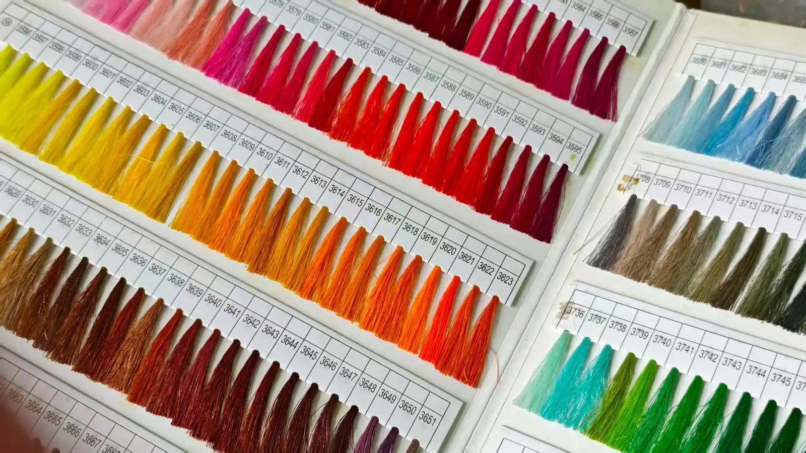
Record the manufacturer, product range, material or finish, thread size designation and shade code. A number alone is incomplete: the same digits in another brand or range do not establish an interchangeable color. Have the supplier identify the proposed thread rather than infer its manufacturer from the card photograph.
Check availability before approving the shade. If the nearest stock option is outside the brand's acceptable range, discuss whether another thread range, a revised color choice or a specially developed option is feasible. Confirm any additional development, minimum quantity, cost and timing for the actual project. Do not assume custom dyeing is available or necessary.
Selecting a thread candidate authorizes the next sample stage. It should not automatically release the full order.
Step 3: Review the finished stitch-out under agreed light
Have the sample made at the intended size with the proposed thread, base fabric and stitch layout. Check the complete patch, including the border and exposed ground. If later finishing or attachment is relevant to the appearance you are approving, include that stage in the sample review.
Place the reference and sample together under an agreed primary light source, with a neutral surrounding area and consistent orientation. For color-critical work, a suitable viewing booth makes the conditions easier to repeat. Also check a relevant second light, such as the actual retail or workplace lighting. An uncontrolled mix of window light and overhead lamps makes disagreements harder to diagnose.
Two materials can appear to match under one light and disagree under another. This is illuminant metamerism, as explained in Coats' guidance on metamerism and illuminants. It concerns the relationship between the two samples; a single patch looking different after you move it is not enough to diagnose it. Record the lights used and which condition governs acceptance.
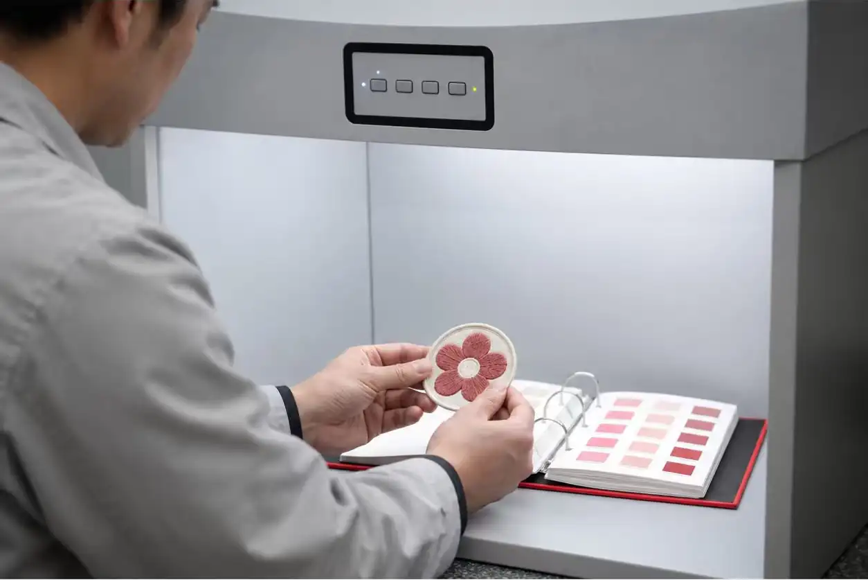
Judge the main fill, lettering and border separately, then look at the whole design. If the patch must coordinate with a garment, inspect it beside the actual garment swatch as well. A successful match to a paper reference does not automatically settle how the finished combination looks.
Photos are useful for discussing placement, shade options and revisions. They remain a limited basis for final color approval because the camera, processing, display and viewing light intervene. Where color is critical, arrange physical sample review before bulk release.
If the buyer requires an instrumental color tolerance, agree on the measurement method, instrument settings, sample presentation, color-difference formula and acceptance limit before testing. Small, textured and directional embroidered areas need a suitable method. A bare "Delta E below X" statement leaves essential conditions undefined; this guide does not prescribe a universal limit.
Step 4: Write an approval record that survives a reorder
An email saying "blue approved" does not identify what the factory should reproduce six months later. Build the approval around the physical sample and the material specification together.
| Record | What to identify | Why it matters |
|---|---|---|
| Brand reference | Complete color system/code and physical swatch identity | Preserves the intended target |
| Thread | Manufacturer, range, material/finish, size designation and shade code | Prevents ambiguous substitutions |
| Sewn sample | Sample ID, date, revision and artwork version | Identifies the accepted appearance |
| Construction | Finished size, ground fabric, border and stitch-file revision | Connects color to the actual design |
| Review conditions | Primary light, secondary light and comparison orientation | Makes later comparisons more repeatable |
| Release decision | Approver, date, accepted differences and any conditions | Separates candidate selection from bulk authorization |
| Repeat-order reference | Retained sample location and supplier lot records where available | Supports a traceable comparison next time |
For example, an approval can identify the sample and state that the listed thread specification and finished appearance are accepted under the recorded lights. It can require another sample if the thread range, finish, ground fabric or stitch layout changes. Use the actual IDs and conditions from the project; this wording is a framework rather than a completed approval.
Keep an identified reference sample with both buyer and supplier where practical, protected from light, dirt and handling. Keep dated photos as a supplementary record. Retained samples can also change with age, so investigate an apparent difference rather than treating an old or damaged sample as infallible.
Allow time for physical samples and corrections in the custom patch lead-time plan. Color approval needs its own decision point before production is released.
How to reduce color surprises on repeat orders
Give the supplier the previous approval record and ask what has changed. Check the thread range and shade code, material availability, dye lot where traceable, base fabric and digitizing revision. A repeated stock shade code is useful information, but it does not replace comparison with the retained approved stitch-out.
Ask how the supplier separates and records thread lots. Avoid mixing different dye lots within the same finished product, and agree how lot changes across an order will be reviewed. If the original shade is unavailable, request a labeled substitute and physical approval before using it.
Review the new production sample against the retained reference under the recorded conditions. If there is a disagreement, first rule out different light, orientation, a changed ground fabric or a damaged reference. Then investigate the thread and construction records. Repeatedly adjusting photographs is a poor way to settle a physical color dispute.
For a YQX custom embroidered patch project, send the artwork, full color references, finished size, quantity, base fabric, backing and any previous approved sample through the project inquiry page. Identify the colors that need physical approval and ask YQX to confirm the proposed thread and sampling arrangements for that order.
Cover: Original workflow illustration. Color blocks are conceptual and do not represent Pantone standards, thread shades or measured samples.