Embroidery gives a handbag more than a decorative motif. The placement of a flower, the space around a leaf and the direction of a stitched surface all contribute to its character. A pale blossom can soften a structured bag, a full floral arrangement can complement a decorative clasp, and scattered blue flowers can give a simple silhouette a lively rhythm.
These four photographs show three floral handbag designs. Looking closely at their composition, color and relationship to the bag itself reveals three distinct ways to make embroidery part of the overall design.
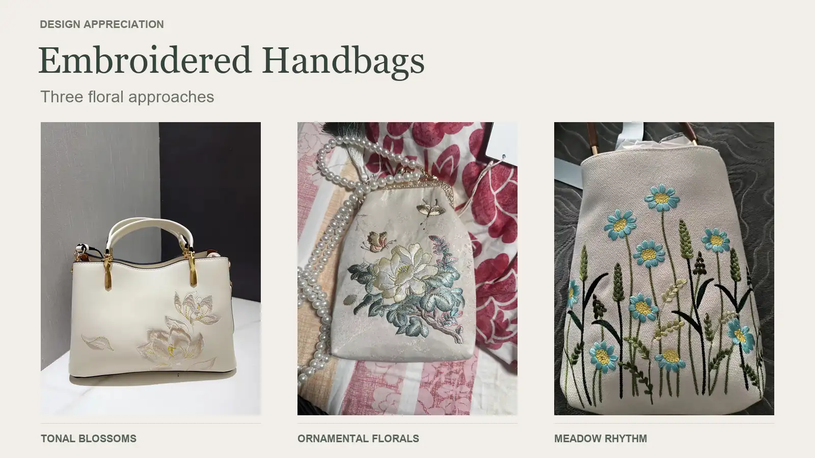
Quiet blossoms on a structured ivory bag
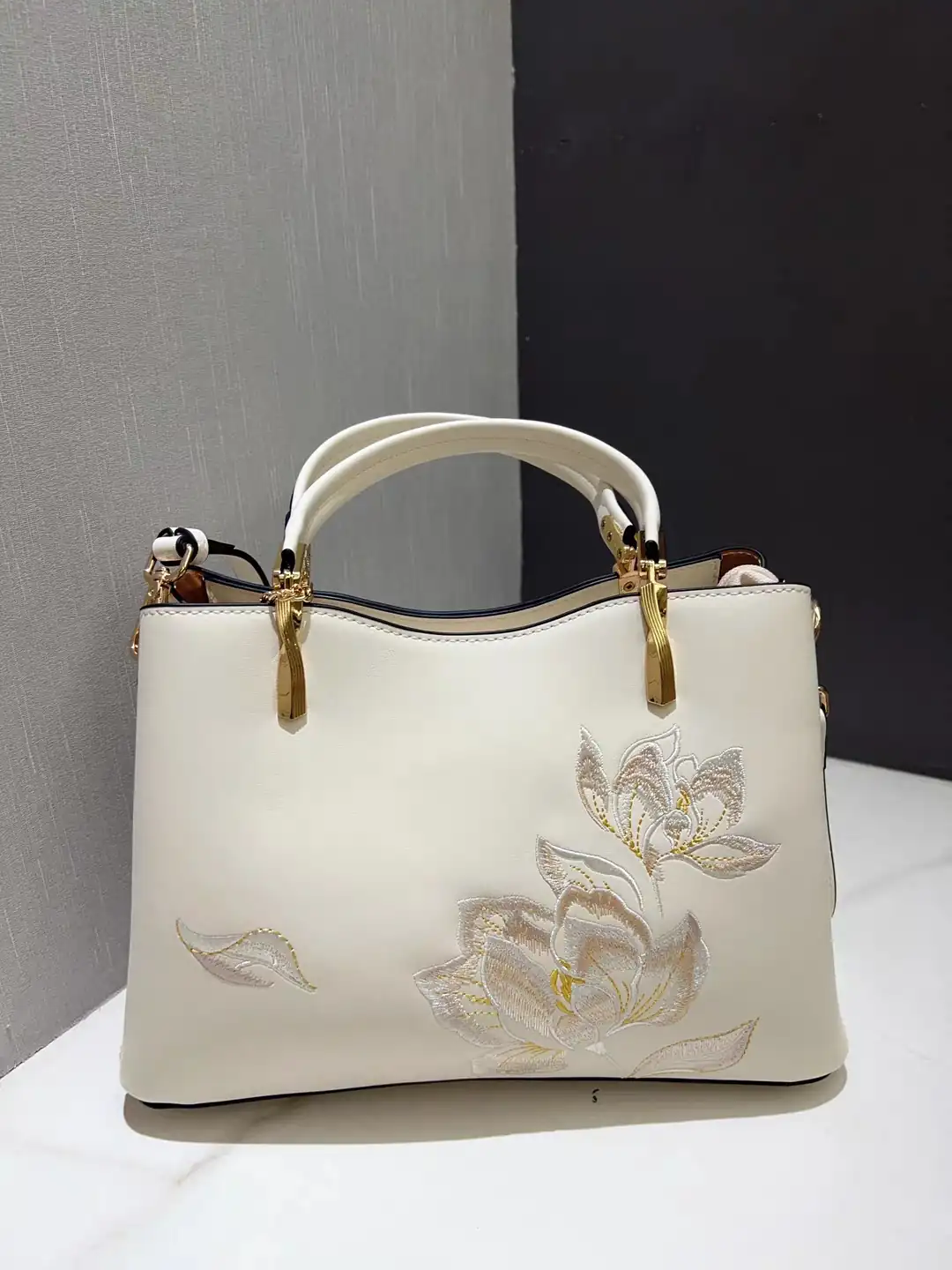
The first design has a restrained palette: ivory, pale silvery tones and small touches of yellow-gold. Because the embroidery stays close to the color of the bag, the flowers become noticeable through their outlines, stitched texture and highlights. The effect is quiet at a distance and more detailed up close.
Placement does much of the work. The main flowers gather in the lower-right portion of the front, with a taller bloom reaching upward. A separate leaf on the left balances the arrangement without making it symmetrical. Between them, the unembroidered surface gives the composition room to breathe.
The rounded petals also introduce a softer shape within the bag’s broad, structured front. Above them, the curved handles and warm-toned fittings give the eye another set of curves to follow. Fine golden accents within the flowers connect the decoration to those fittings without repeating their visual weight.
This is a useful design reference for anyone drawn to subtle floral accessories. The flowers remain a focal point, while much of the bag’s original surface and outline stays visible. A motif does not need to cover the whole front to give the bag a recognizable identity.
A full floral arrangement beneath a decorative clasp
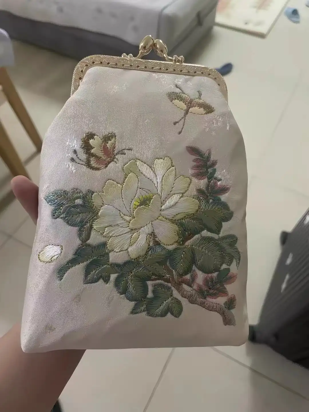
The frame purse takes a fuller approach. Its large central flower is surrounded by layered-looking petals, dark green leaves, smaller pink details and a branch that moves diagonally across the lower section. Small winged motifs occupy the space above the flower, carrying the eye toward the clasp.
Although the arrangement contains more detail, it has a clear hierarchy. The light flower is the largest shape. The darker leaves help define its edge, while the pink accents add smaller points of interest. The open space near the top keeps the decorative metal frame readable.
The flower’s petal surfaces are especially worth studying. Adjacent stitched areas run in different directions and appear to catch the light differently. Together with the overlapping outlines, those changes give the flower a sense of turning and folding. The distinction between a pale petal and the pale background is often carried by texture and edge detail rather than a strong color change.
The clasp and floral arrangement share an ornamental character. Small curves in the frame echo the rounded shapes below, so the hardware feels connected to the embroidery. This is a different balance from the ivory bag: here, several decorative elements participate in the same overall mood.
The same design, seen with its shoulder chain
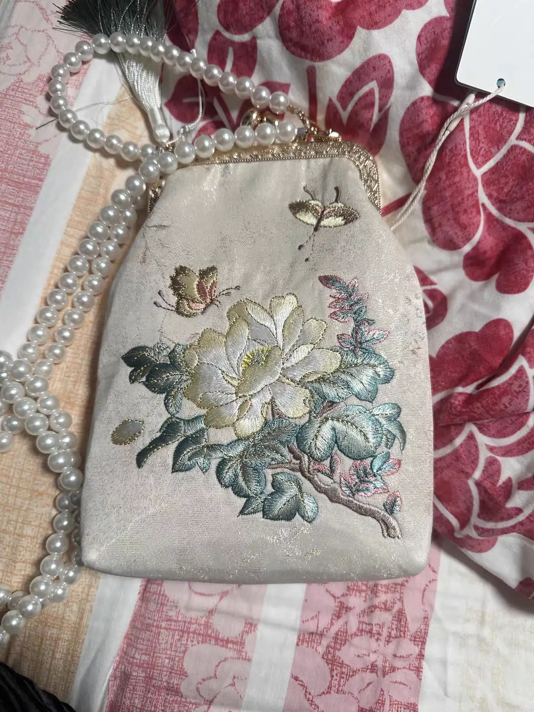
The second view adds an important part of the styling: a chain of round, pearl-like beads. Their soft highlights sit comfortably beside the pale flower and rounded clasp. Seen together, the embroidery, frame and chain create a more dressed-up impression than the floral panel alone.
The photographs also show why it helps to view an embroidered accessory from more than one angle. The green leaves look darker in some areas and brighter in others as the lighting and position change. These views should be read as two presentations of the same floral design, rather than separate color versions.
When considering a bag like this, look at the whole object first, including its chain and clasp. Then move closer to the flower. The large-scale arrangement and the small stitched details offer different kinds of visual interest.
Blue flowers rising across a textured bag
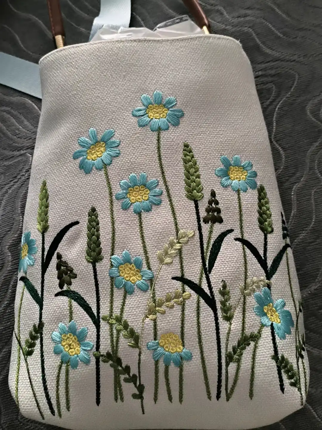
The third design replaces the single large floral focal point with a group of smaller flowers. Blue petals and yellow centers repeat across the bag, while narrow stems and taller green forms connect the arrangement to the bottom edge.
The variation in height is what makes it feel lively. One flower rises near the top, others sit at the middle, and smaller blooms appear lower down or near the sides. They share a visual language without forming a rigid grid. The eye moves between them much as it would move across a patch of flowers.
Color is more assertive here. The blue petals stand out against the light background, and the yellow centers provide a warm accent. Different greens, including very dark stems and leaves, give the lower area more visual weight. That darker base makes the flowers above it feel lighter.
There is also a clear contrast between surfaces. The bag’s visible ground has a pronounced woven texture, while the petals contain smoother-looking stitched areas. The rounded yellow centers introduce another small-scale texture. Appreciating the design means noticing these surfaces together, not just identifying the flower shapes.
Compared with the pale ivory bag, this composition feels more relaxed and playful. Its interest comes from repetition, changing heights and a broader spread of embroidery across the front. The bag becomes a small setting for the flowers rather than a background for one isolated motif.
What connects these three approaches?
All three designs relate the embroidery to the available surface, but they use that surface differently. The ivory bag keeps a large area open and concentrates attention in one corner. The frame purse builds around a central flower, with smaller details extending toward the clasp. The blue-flower bag distributes its motifs across the front in a rising pattern.
Their palettes reinforce those choices. Close shades on the ivory bag invite a slower look at texture. Pale petals against darker foliage make the frame purse’s main flower easy to find. Repeated blue and yellow accents give the meadow design a clear rhythm.
For a new handbag concept, these are useful visual decisions to separate: where the eye should go first, how much background should remain visible, and how the stitching should relate to the handles, frame or other fittings. Choosing those relationships gives a floral idea more direction than choosing a flower alone.
The photographs support an appreciation of visible design. They do not establish the fiber content, exact bag materials, hand or machine production method, or the composition of the pearl-like beads. Lighting also affects apparent color and shine.
Bring a floral idea into a handbag project
If one of these approaches suits a new collection, describe the feature that appeals to you: a quiet tonal flower, a full floral centerpiece or a scattered meadow arrangement. Pair that reference with the intended bag shape, colors and placement.
YQX’s handbag panel and component embroidery is a relevant starting point for developing an embroidery concept around the product. To discuss your own design, contact YQX with the artwork or visual reference, bag or panel dimensions, material information and quantity. The photographed bags serve as design references; a new project needs its own agreed artwork and sample.
Cover: three handbag designs arranged from the supplied photographs; shown at different photographic scales.